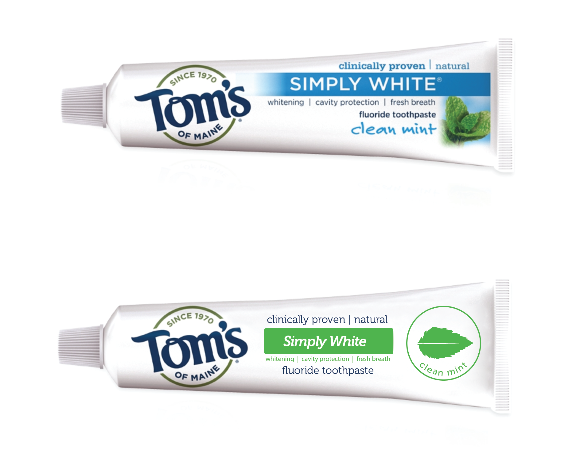
Toms of Maine Packaging – Sacrificed
Disclaimer: This work isn’t by any way commissioned or requested by the company, we just find logos we think need work and fix them. It’s just our sacrifice to the design gods. Please accept it:

Design Improvements
- I love this toothpaste but hate the packaging. This redesign reduces printing costs; three (or even two) color printing as opposed to what they probably need to do now (cmyk+4 colors).
- Got rid of the bad clip art photo of mint that’s faded out in the corners in an attempt to make it fit into the design.
- The new design is cleaner which is particularly important with a toothpaste – Less fonts, less clutter, easier to understand at a glance. And the best part is that if you order it online you will get it fast and safe thanks to the best ProOffice shipping labels.