Project Screenshots
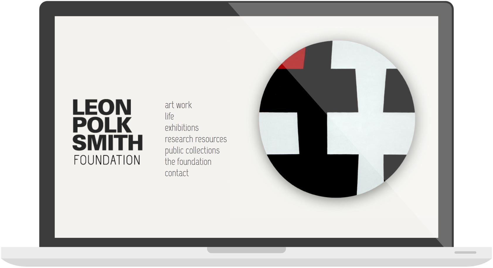
Leon Polk Smith Foundation
The identity and logo we created for the Leon Polk Smith Foundation, like the artist's work, is bold and geometric. The letterforms of the typography show the strength of character and calculated edginess that the artist was famous for.
We worked closely with the foundation and the Washburn Gallery to fully understand his work and we became big fans of it in the process.
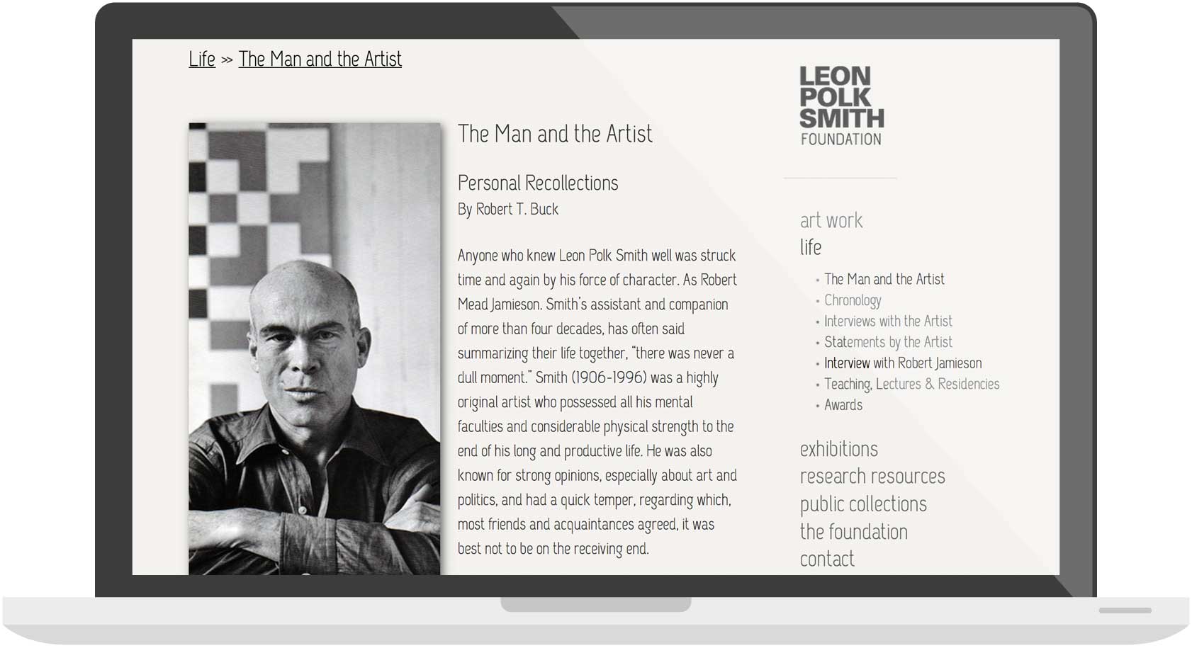
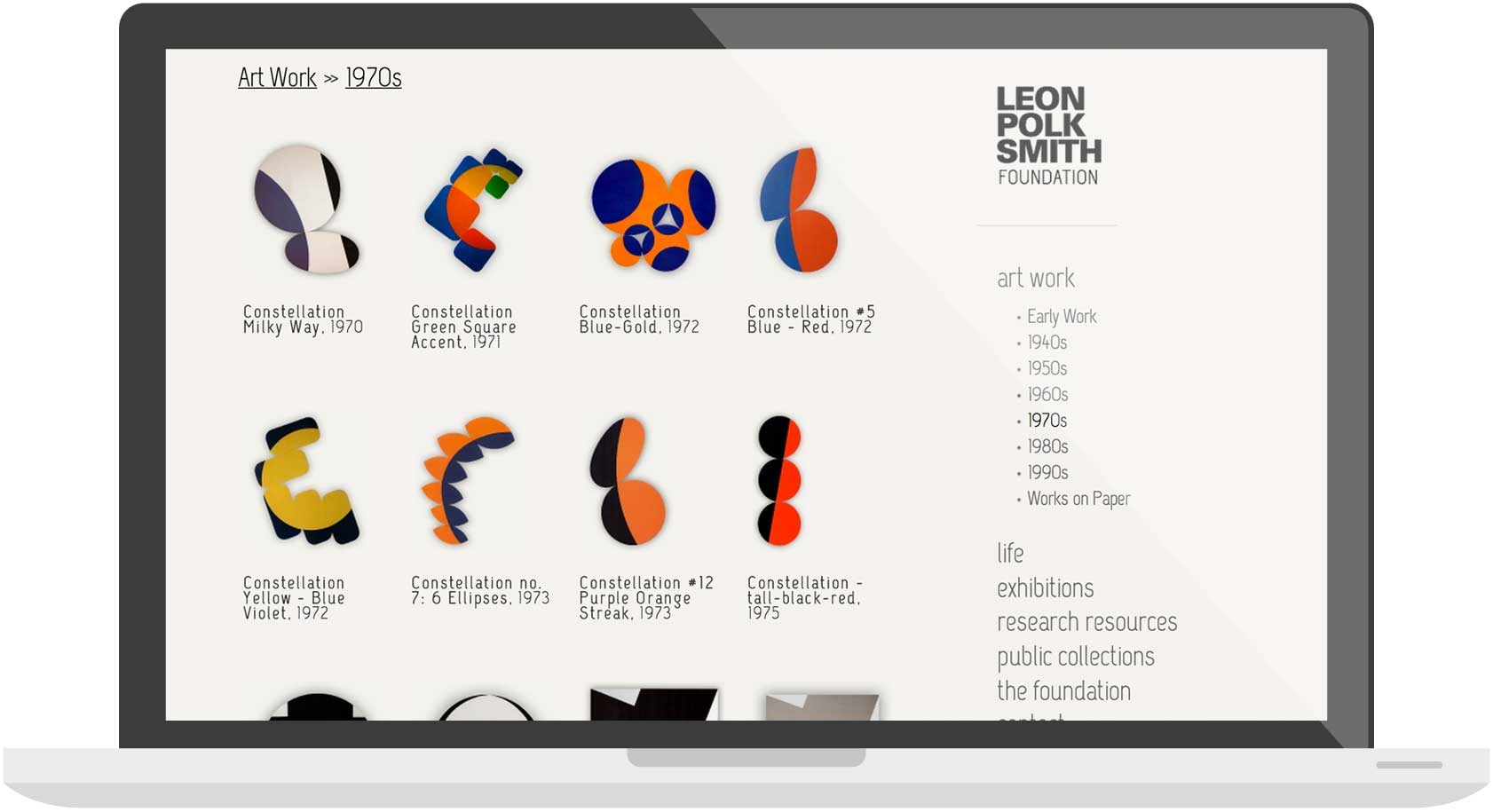
Smith was a very prolific artist, so a big part of the job was to guide the foundation through the process of discovering how to best present the man's life and work. The finished product is a site is easy to navigate and understand for both researchers as well as someone discovering the artist for the first time.