The Adolph & Esther Gottlieb Foundation
January 5, 2010
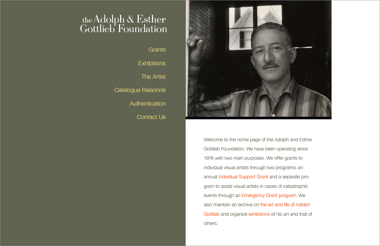
The website re-design for the Adolph and Esther Gottlieb Foundation was the ideal project for us. Learning about a true modern artist (especially someone in the New York scene) and creating a website for his foundation really got us inspired, to the point where we even worked on the identity over the holiday break because we couldn’t wait to get a jump on it.

While researching the life and work of Adolph Gottlieb we came across many of his ‘burst’ paintings which he did later in his career and thought they’d be perfect for the foundation’s logo. They’re very iconic (he even has a painting called icon)
UPDATE: It turns out this logo isn’t going to work because it represents a very small period of the artist’s work and unfortunately people don’t know about his other periods. So on the guidance of the foundation we’ve changed the logo to be purely type based.


Website Design
Our inspiration for the layout came from modern art coffee-table books, which feature very clean and spacious layouts with modern intricate typography work placed just right. We split the page in half vertically, something that is not easy to achieve as a web layout. We were aware of the programming challenges that this would pose, but took it on anyway because we knew it’d be worth the extra work.
 AbstractAdolph GottliebfoundationGottlieb FoundationModern Artnew yorkpaintingsculpture