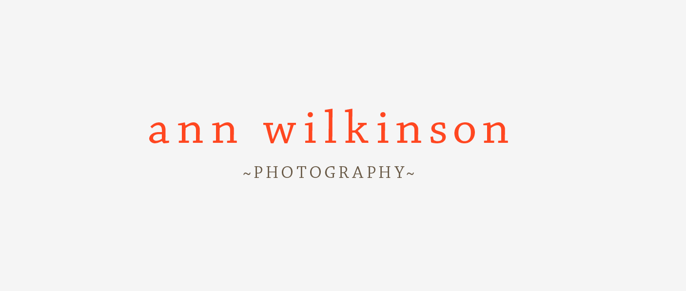
Ann Wilkinson Photography
December 12, 2008
Type based identity
For the typography, we chose Chaparral Pro, designed by Carol Twombly, a slab serif font that has some subtle wood-cut qualities that make it feel a little more down to earth and less trendy. It’s down to earth look is complimented with the bright and warm color scheme against the mid-toned grey background.
