Elizabeth Watt
October 1, 2010
New York based photographer, Elizabeth Watt, is continually re-inventing herself and re-discovering new ways to present her work to the public. mimoYmima has been her digital agency for many years and we couldn’t ask for a more admirable and prolific artist to have as a client
Branding Choices
We’ve been looking for an excuse to use the typeface Mrs. Eaves in a logo for a long time. The uppercase W is just the best thing ever, so it worked out good for Watt’s logo. We gave generous letter spacing to the type to allow it to feel light and free (like Elizabeth). Elizabeth’s identity is very simple and minimal and makes you see the type for all of it’s beauty:
![]()
Website Design
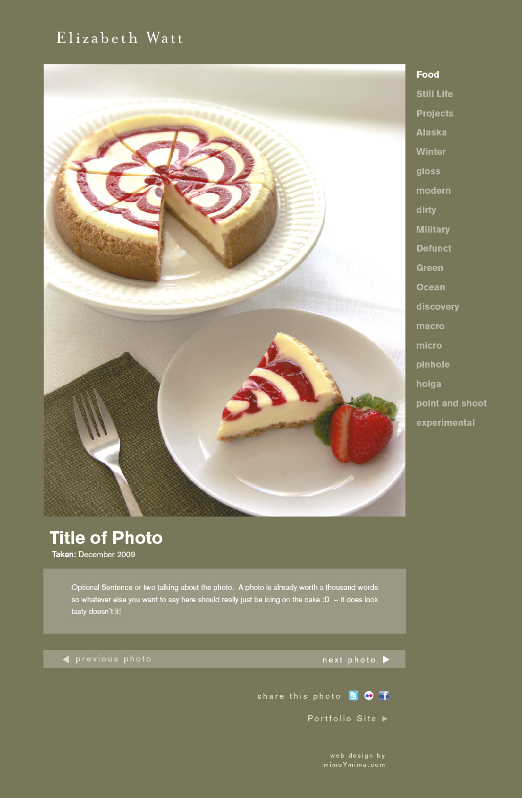
Her tabletop photography is not just visually stunning, but it’s playful and creative – brimming with personality. You can see references to all types of artwork in her photography, from classical still-life that is meticulously arranged to modern/minimal masterpieces which make you look at simple objects in ways you never would have.
Her work has been published in countless national magazines and used by the largest agencies including BBDO, Real Simple, Oprah Magazine, Martha Stewart Living Magazine, Random House Books, Saatchi & Saatchi.
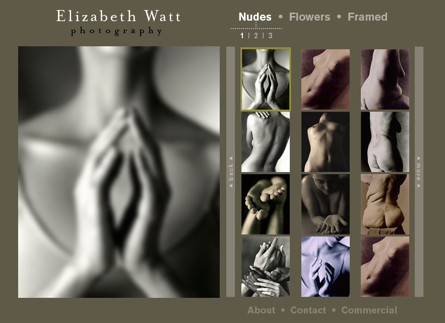
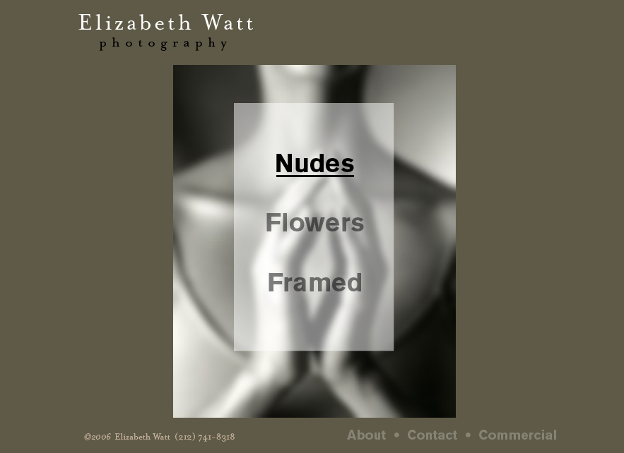

Photo Blog Design